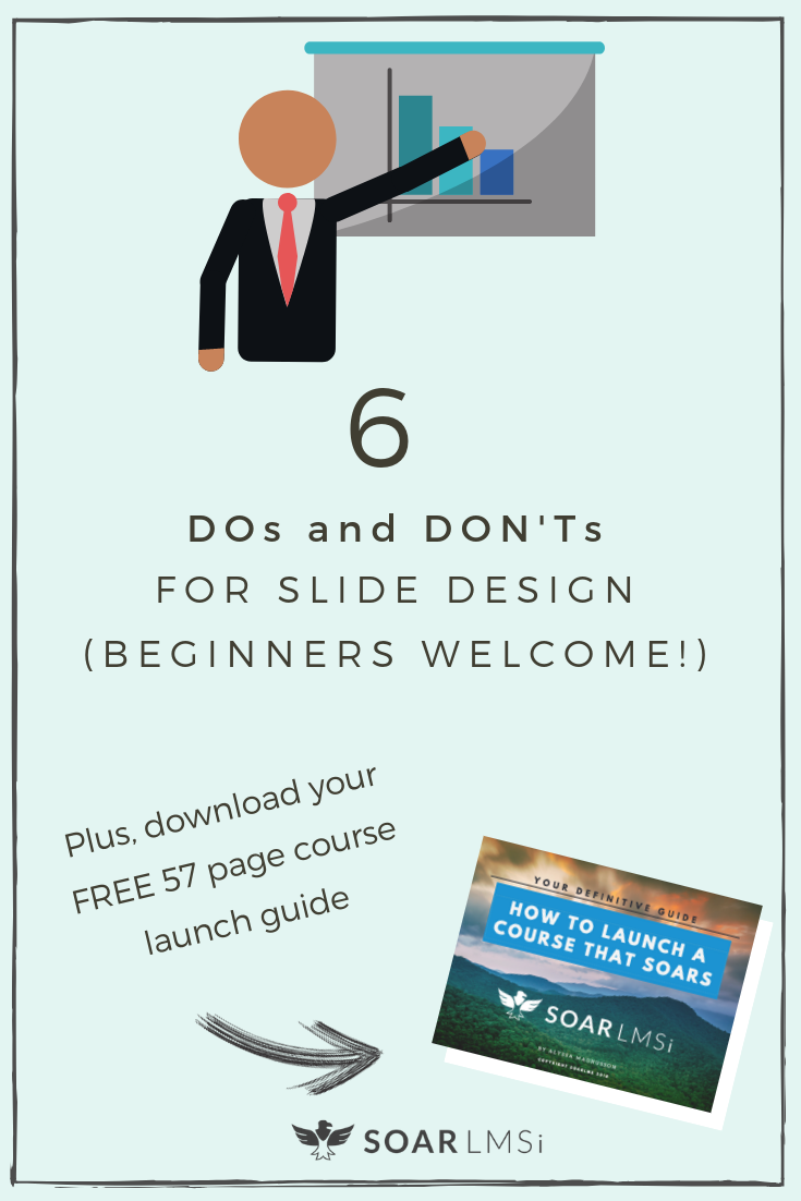
6 Slide Design Tips for Online Course Creation Beginners

6 Simple Slide Design Tips for Course Creation Beginners
Don’t let “Design Fear” stop you from creating your course!
Have you ever said the following:
- “My art is limited to stick figures.”
- “I don’t have a creative bone in my body.”
- “Design is not my gift.”
“Ya, I have an idea to teach but I wouldn’t know the first thing about creating a course.”
Well, we don’t want to let any of those things stop you from turning your expertise into a course! When it comes to presenting your course, you don’t have to be DaVinci or Van Gogh, just focus on these 2 most important things:
- Get your material across clearly (no distractions) &
- Present your material in a way students will remember / engage in
A very common way of presenting your course is by creating slides, then recording them with a voiceover (just like a lecture or presentation). This is a super simple way to get your point across – and you don’t even have to be on camera. Recording slides is a very quick and cost effective way to put your content together.
Designing slides to get the maximum learning!
To accomplish our 2 objectives (no distractions and high engagement), there are a few tips you can implement as you design them. Below is a handy slide-guide with 6 design basics for beginners. (Fear not, creatively-disinclined person. You too can present a beautiful, professional-looking course with these tools and tips.)
*Get all our course design tips! Download our free, 57 page guide “How to Launch a Course that Soars”.
Getting started with slide design
Use slides to focus and engage your audience, as well as break your information into more bite-sized, manageable pieces.
First, you’ll need to pick a program! Your computer should have a free one like PowerPoint or Keynote, or you can try Google Slides, or Canva (also free, accessible online).
Set-up your slide format in widescreen to be able to film them. The dimensions for this are 16:9. Remember these dimensions. Love them. They will make your life easier.
Let’s breakdown the DOs and DON’Ts of slide design with some basic design principles (this can translate to all content you are designing!).
1. DO Be consistent
Your website, physical materials, and social media—anything you produce— should reflect your brand and logo.
Be consistent in fonts, colors, and reiterating foundational principles throughout your branding. What do you want people to feel when they see your material? Continually reinforce that.
To see an example of consistency across multiple platforms, check out Boy with a Ball, a youth development organization. Across many channels, you’ll see bright colors and bright faces, the same 2-3 fonts and of course, their logo.

2. DO Choose colors intentionally
When picking colors for your brand or slides, do research on the psychology of color and color’s effect on mood. Choose a color important to you and the ones that help invoke the feeling you want your audience to have.
Here’s a helpful chart with mood correlations.
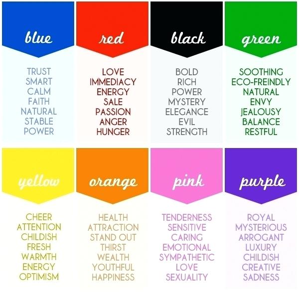
Once you have a main color, choose a theme /scheme including 1-2 other colors to create more visual interest. These will act as accent colors on your slides or other design work.
You can experiment with color schemes on Coolors. You don’t have to sign up for the account, just click on the spacebar to generate schemes until you find one you like!
Once you have a theme you like, save the hex codes (this is a number that corresponds to an exact color, #_____) . Keep these so you can get an exact match on any program where you are designing.
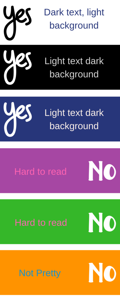
When it comes to slides specifically, make sure you have contrast in backgrounds and don’t use painful color combos. Color combos you should never use are: red and green, orange and blue, and red and blue.
3. DON’T use too much text
People can get overwhelmed quickly! If you use a ton of text, your students will focus more on reading it than on listening to you. If you have something people need to read, upload it as a text file or lesson.
Slides should reinforce your words, not repeat them.
Always remember the 1 6 6 rule for text: each slide should have one main point, no more than six bullets to make that point, and no more than six words per bullet.

4. DON’T go font crazy
For your logo and brand as a whole, have no more than three fonts.
Here’s a fun SlideShare presentation on “The 7 Deadly Font Sins”.
In your slides, legibility and simplicity are the most important elements. Let the theme, colors and visuals carry the design. Type should be clean. Don’t use a decorative font on your slides, except for an accent word or title.
For legibility purposes, using a Sans Serif font has been shown to be easier to read on mobile devices and evoke a casual nature. Serif fonts inspire feelings of trust.
5. DO Use Meaningful Images
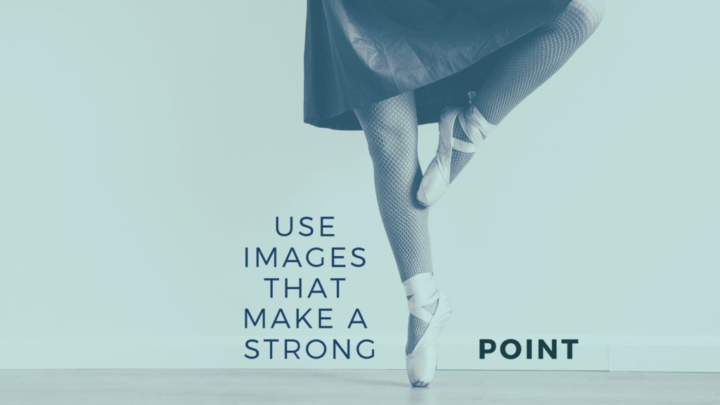
Images help memory
(Gifs do, too).

People will remember your point better if it’s connected to an image (thanks social media and Millennials). That being said, use powerful images to make that point! Relevance is important—images should enhance your point, not distract from it.
So get creating!
Don’t let design fear put a halt to your course creation dreams!
For slide design and theme ideas, visit SlideShare! This site is full of presentations on all sorts of different subjects!
And, that was your crash course in slide design! Remember: consistency will be the key to establishing yourself as a professional brand. Getting your point across is the most important thing. If that comes through, people will give you a lot of grace on the presentation. You’re going to rock it!
Start creating your course on our beautiful, user-friendly platform! Start for free, no cc required!